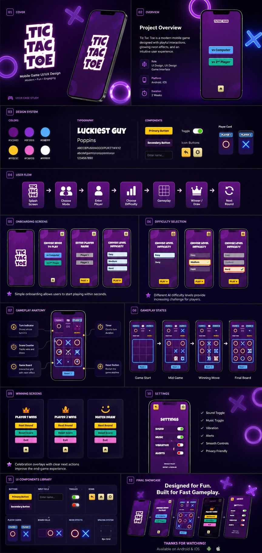
Tic Tac Toe is a modern mobile game designed with playful interactions, glowing neon effects, and an intuitive user experience. The case study covers the complete design system, user flow, onboarding, difficulty selection, gameplay anatomy, states, winning screens, settings, and a full UI components library.
The complete Behance-style case study walks through cover, overview, design system, user flow, onboarding, difficulty selection, gameplay anatomy, states, winning screens, settings, components library, and final showcase.
Complete game UI/UX case study
01
Project Overview
Tic Tac Toe is a modern mobile game designed with playful interactions, glowing neon effects, and an intuitive user experience. The work spans a complete UI/UX case study from design system through final showcase.
02
Project Goals
Create a visually engaging, easy-to-learn mobile game with clear modes, AI difficulty levels, and delightful micro-interactions that make every round feel fresh.
03
Problem Statement
Classic casual games often feel dated or visually flat, lacking the polish, feedback, and onboarding clarity expected by modern mobile players.
04
Design Challenge
Design a complete game interface — splash screen, mode selection, player setup, difficulty, gameplay HUD, winning states, and settings — while maintaining a cohesive neon visual language and intuitive flow.
05
Solution
A dark, neon-lit interface built around a structured design system: Luckiest Guy display type paired with Poppins UI text, a purple-led palette with cyan and pink accents, reusable buttons, toggles, player cards, and board cells. The flow guides users from splash to gameplay in seconds, with clear feedback at every state.
06
User Flow
Splash Screen → Choose Mode → Enter Player → Choose Difficulty → Gameplay → Winner/Draw → Next Round.
07
Typography
Luckiest Guy for bold display headlines and game branding; Poppins for UI labels, body copy, and component text.
08
Color Palette
Deep purple base (#5C2483, #8F39D8) with neon cyan (#59B7FF), pink (#FF63C3), yellow (#FFD33C), and clean white (#FFFFFF) accents for high-contrast, playful moments.
09
Design System
A structured component library including primary/secondary buttons, toggles, icon buttons, input fields, player cards, board cells, neon effects, and spacing system — all documented for consistent implementation.
10
Components
Primary and secondary buttons, toggles, icon buttons, player cards, board cells, neon effect treatments, and a spacing grid.
11
Feature Highlights
vs Computer mode · vs 2nd Player mode · Easy/Medium/Hard AI difficulty · Turn indicator and timer · Score counter · Game board with neon effects · Winning move celebration · Reset and exit actions · Sound, music, vibration, alerts, and smooth controls settings.
12
UI Showcase
The uploaded case study presents the full product surface: cover, overview, design system, user flow, onboarding screens, difficulty selection, gameplay anatomy, gameplay states, winning screens, settings, UI components library, and a final showcase.
13
Mobile Mockups
Onboarding screens, difficulty selection, gameplay anatomy, gameplay states, winning screens, and settings are shown inside realistic mobile frames.
14
Results
The case study demonstrates a complete mobile game design system with consistent components, clear player feedback, and a cohesive neon aesthetic across every screen state.
15
Final Results
A polished, Behance-ready game UI/UX case study that proves casual games can be modern, minimal, and highly engaging through considered motion and visual restraint.
16
Project Conclusion
Tic Tac Toe shows how a familiar game can be reimagined through a bold visual identity, structured design system, and player-centered interactions — designed for fun and built for fast gameplay.
17
Key Takeaways
Casual games benefit from clear onboarding, immediate feedback, and a consistent visual system. Neon accents and motion can elevate even the simplest mechanics when used with restraint.