← All Projects
Brand Identity · Product DesignCompletedFeatured

Jetloom

Jetloom is the all-in-one workspace that helps teams plan projects, manage tasks, collaborate seamlessly, and deliver results faster. The work covered positioning, brand pillars, a geometric logo system, a Poppins-led typeface system, and the app and website UI.
Jetloom
Role
Brand & Product Designer
Duration
2 months
Tools
FigmaIllustratorPhotoshop
Tech
Mobile AppResponsive Web
01

Brand Positioning

Jetloom brings work, communication, documents, and workflows together in one intuitive platform, eliminating complexity so teams stay organized, focused, and productive from start to finish.
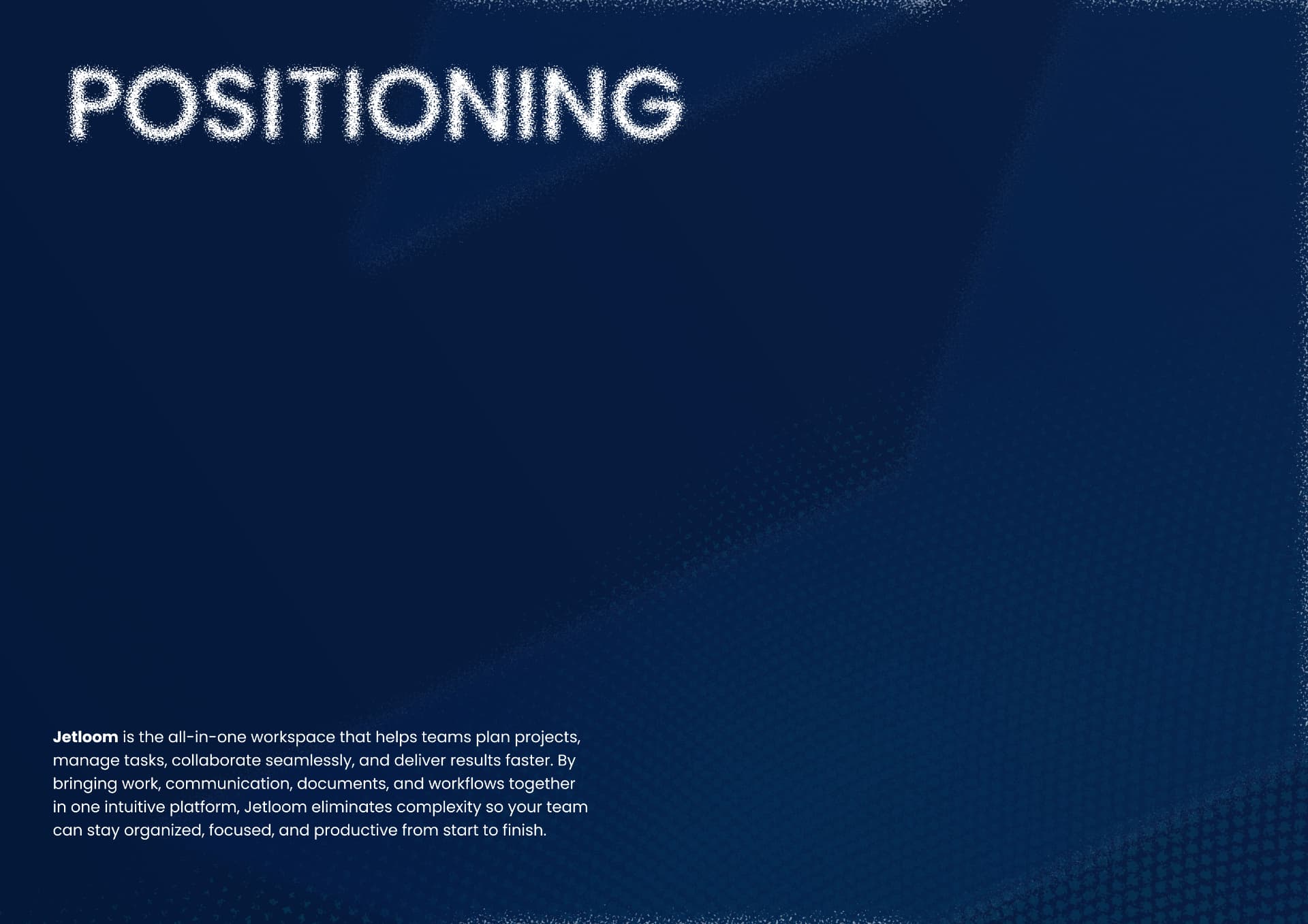
Jetloom brand positioning statement
Positioning
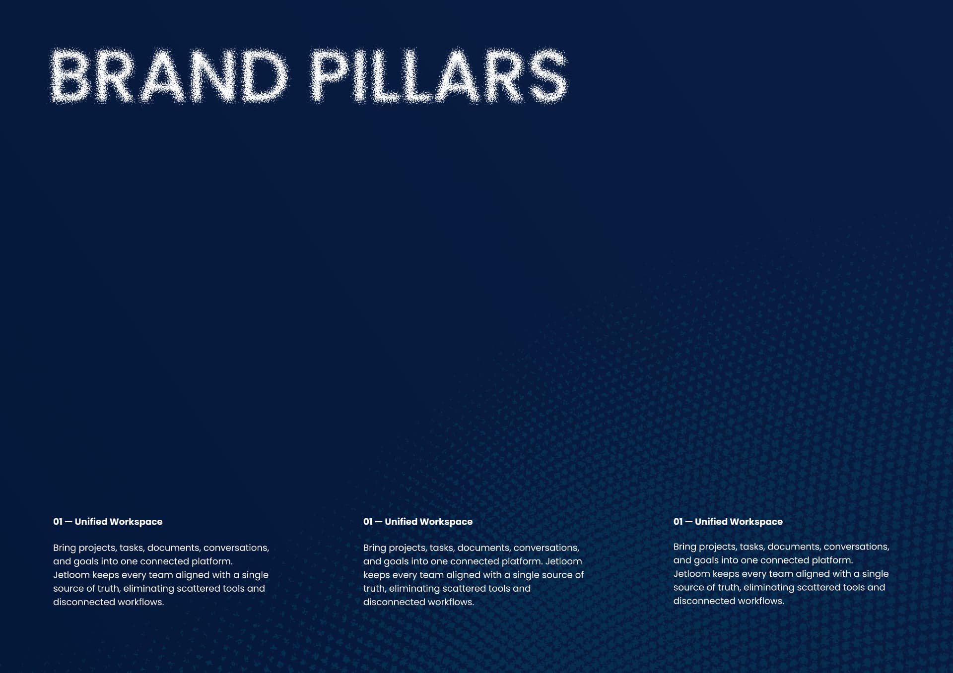
Jetloom brand pillars
Brand pillars
02

Logo & Identity System

Geometric logo construction, colour dynamics, and app icon treatments across light, gradient, and dark surfaces.
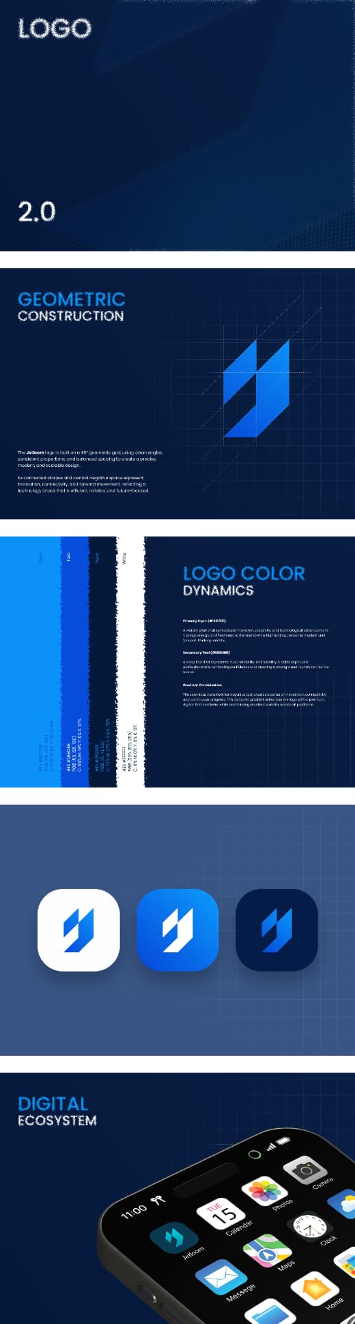
Jetloom logo construction and colour system
Logo 2.0 — construction, colour, digital ecosystem
03

Typeface System

Poppins across weights, cases, and numerals — the typographic backbone of the brand.
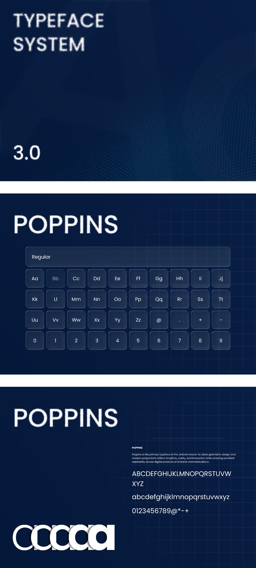
Jetloom Poppins typeface system
Typeface system 3.0
04

App & Website

Mobile screens and desktop dashboard mockups showing the workspace in use.
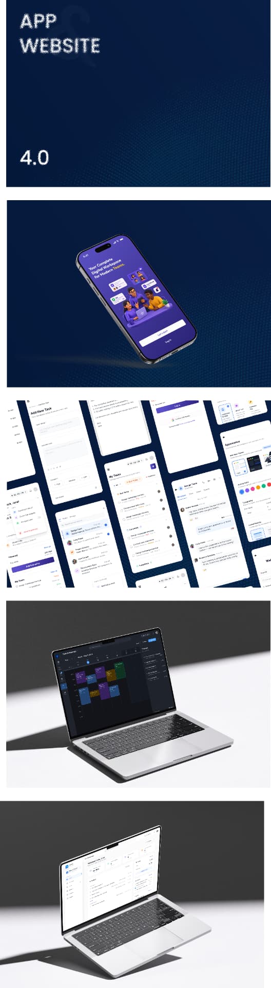
Jetloom app and website mockups
App & website 4.0
01

Project Overview

A complete brand guideline and product design system for Jetloom — a unified workspace for modern teams.
02

Problem Statement

Teams juggle scattered tools and disconnected workflows, with no single source of truth for their work.
03

Solution

One connected platform, expressed through a precise geometric identity, a clear typographic system, and a calm, focused product UI.
04

Typography

Poppins as the primary typeface — clean geometric forms and modern proportions that reflect simplicity, clarity, and innovation while staying highly readable across digital products and brand communications.
05

Color Palette

Primary Cyan (#18C7E1) for innovation and technological advancement, Secondary Teal (#1565D8) for trust and reliability, and a deep Navy base, combined through a dynamic gradient.
06

Design System

The Jetloom mark is built on a 45° geometric grid with clean angles, consistent proportions, and balanced spacing. Its connected shapes and central negative space represent innovation, connectivity, and forward movement.
07

Feature Highlights

Unified workspace · Project and task management · Team collaboration · Documents and goals in one place.
08

Final Results

A scalable identity and product system spanning app icons, mobile screens, and desktop dashboards.
Next project

Rawdah

Premium product website with refined typography and editorial visual hierarchy.